● URL : https://colab.research.google.com/drive/17fDUSIMceVK584ojytdSVkJetEYfJ1Rb
: 선형 분류기, 여러 독립 변수로부터 범주형 종속 변수를 예측하는데 사용된다.
- p : 확률
- 시그모이드 곡선
- 최대가능성 (Maximum Likelihood)을 통해 모델 적합성 판단한다.
각 데이터 포인트 살펴본다.
모든 숫자를 곱한다.(예, 1-아니오)
정규화 강도의 역수 C, C 작을 수록 정규화 강해져 과적합으로부터 보호 가능
Step 1. Importing the libraries
import numpy as np
import matplotlib.pyplot as plt
import pandas as pd
Step 2. Importing the dataset
dataset = pd.read_csv('Social_Network_Ads.csv')
X = dataset.iloc[:, 1:-1].values
y = dataset.iloc[:, -1].values
Step 3. Splitting the dataset into the Training set and Test set
from sklearn.model_selection import train_test_split
X_train, X_test, y_train, y_test = train_test_split(X, y, test_size = 0.25, random_state = 0)
Step 4. Feature Scaling
from sklearn.preprocessing import StandardScaler
sc = StandardScaler()
X_train = sc.fit_transform(X_train)
X_test = sc.transform(X_test)
Step 5. Training the Logistic Regression model on the Training set
from sklearn.linear_model import LogisticRegression
classifier = LogisticRegression(random_state = 0)
classifier.fit(X_train, y_train)
Step 6. Predicting a new result - 단일 결과 예측
print(classifier.predict(sc.transform([[30,87000]])))
--------------------------------------------------------------------------------------------------------------------------------------------------------------------
위에서 특성 스케일링을 적용하여 학습시켰기 때문에, 예측하고자 하는 단일 독립 변수에 특성 스케일링을 적용한다.
--------------------------------------------------------------------------------------------------------------------------------------------------------------------
Step 7. Predicting the Test set results
- concatenate : 동일한 형태의 두 개 이상의 벡터 또는 배열을 수직이나 수평 방향으로 연결하는 함수
- reshape : 벡터나 배열의 모양을 변경할 수 있는 함수
y_pred = classifier.predict(X_test)
print(np.concatenate((y_pred.reshape(len(y_pred),1), y_test.reshape(len(y_test),1)),1))
--------------------------------------------------------------------------------------------------------------------------------------------------------------------
※ 예측 값과 실제 값 함께 출력한다.
(1) concatenate(((벡터 또는 배열),(...)), 축)) :예측 수익을 담은 벡터와 실제 수익을 담은 벡터 수직으로 연결 (0: 수직, 1: 수평)
(2) reshape(요소 (행)개수, 열 개수) : 벡터의 형태를 요소 개수만큼의 행을 가진 배열로 변경
--------------------------------------------------------------------------------------------------------------------------------------------------------------------
Step 8. Making the Confusion Matrix
- confusion_matrix : 혼동 행렬
- accuracy_score : 정확도
from sklearn.metrics import confusion_matrix, accuracy_score
cm = confusion_matrix(y_test, y_pred)
print(cm)
accuracy_score(y_test, y_pred)
--------------------------------------------------------------------------------------------------------------------------------------------------------------------
혼동 행렬 (Confusion Matrix) : 모델의 예측 결과를 행렬 형태로 나타낸 것
정확도 (Accuracy) : 모델이 정확하게 예측한 샘플의 비율로, 맞게 예측한 샘플의 수/전체 샘플 수
--------------------------------------------------------------------------------------------------------------------------------------------------------------------
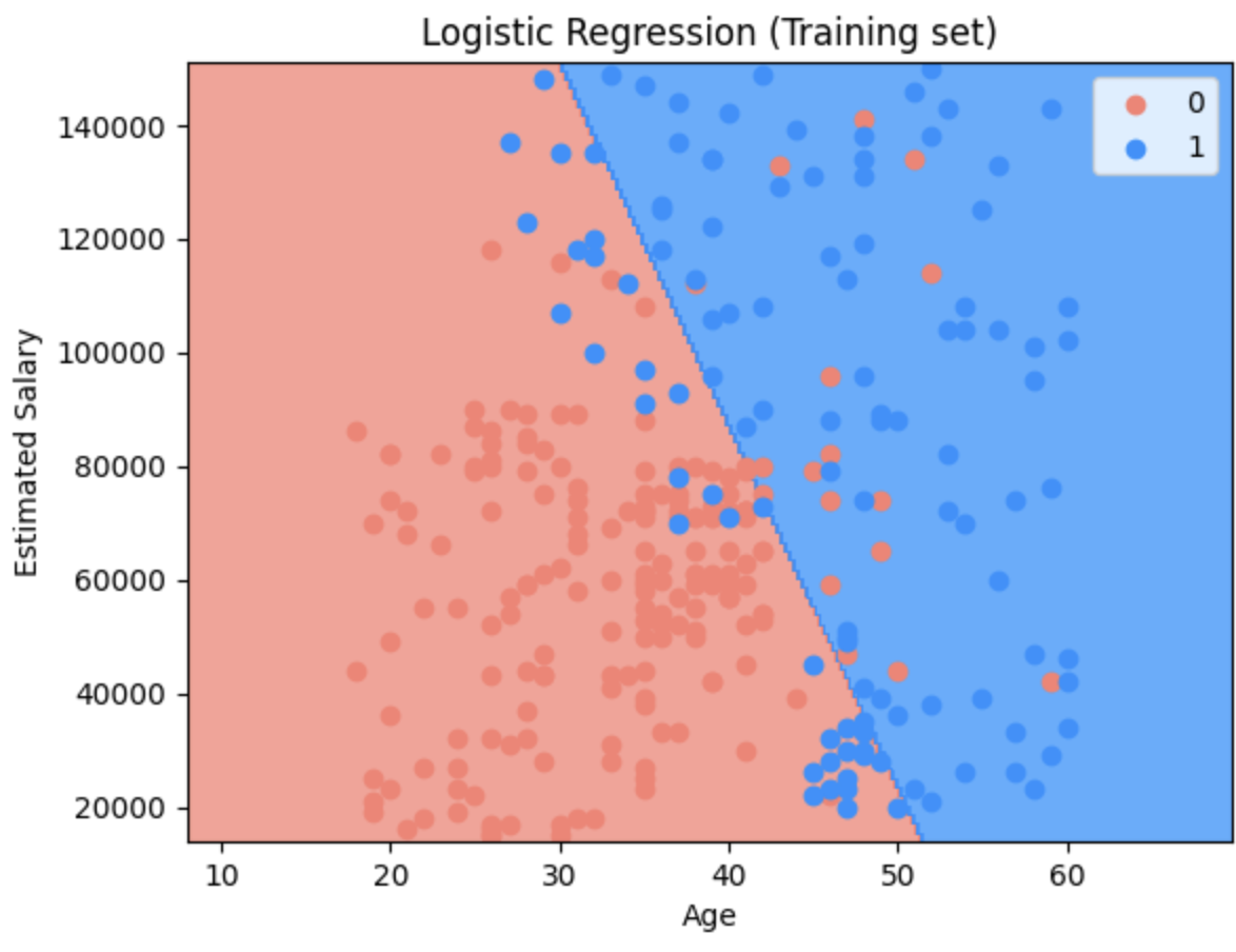
Step 9. Visualising the Training set results
from matplotlib.colors import ListedColormap
X_set, y_set = sc.inverse_transform(X_train), y_train
X1, X2 = np.meshgrid(np.arange(start = X_set[:, 0].min() - 10, stop = X_set[:, 0].max() + 10, step = 0.25),
np.arange(start = X_set[:, 1].min() - 1000, stop = X_set[:, 1].max() + 1000, step = 0.25))
plt.contourf(X1, X2, classifier.predict(sc.transform(np.array([X1.ravel(), X2.ravel()]).T)).reshape(X1.shape),
alpha = 0.75, cmap = ListedColormap(('salmon', 'dodgerblue')))
plt.xlim(X1.min(), X1.max())
plt.ylim(X2.min(), X2.max())
for i, j in enumerate(np.unique(y_set)):
plt.scatter(X_set[y_set == j, 0], X_set[y_set == j, 1], c = ListedColormap(('salmon', 'dodgerblue'))(i), label = j)
plt.title('Logistic Regression (Training set)')
plt.xlabel('Age')
plt.ylabel('Estimated Salary')
plt.legend()
plt.show()
Step 10. Visualising the Test set results
from matplotlib.colors import ListedColormap
X_set, y_set = sc.inverse_transform(X_test), y_test
X1, X2 = np.meshgrid(np.arange(start = X_set[:, 0].min() - 10, stop = X_set[:, 0].max() + 10, step = 0.25),
np.arange(start = X_set[:, 1].min() - 1000, stop = X_set[:, 1].max() + 1000, step = 0.25))
plt.contourf(X1, X2, classifier.predict(sc.transform(np.array([X1.ravel(), X2.ravel()]).T)).reshape(X1.shape),
alpha = 0.75, cmap = ListedColormap(('salmon', 'dodgerblue')))
plt.xlim(X1.min(), X1.max())
plt.ylim(X2.min(), X2.max())
for i, j in enumerate(np.unique(y_set)):
plt.scatter(X_set[y_set == j, 0], X_set[y_set == j, 1], c = ListedColormap(('salmon', 'dodgerblue'))(i), label = j)
plt.title('Logistic Regression (Test set)')
plt.xlabel('Age')
plt.ylabel('Estimated Salary')
plt.legend()
plt.show()
