회귀란,
● URL : https://colab.research.google.com/drive/1GIjr0AQFCeShMK_RWN3nsGicUDvGuiXH
※ 최소제곱법
Step 1. Importing the libraries, 라이브러리 불러오기
Step 2. Importing the dataset, 데이터세트 불러오기
Step 3. Splitting the dataset into the Training set and Test set
Step 4. Training the Simple Linear Regression model on the Training set
- linear_model : 선형회귀 모듈
- LinearRegression : 선형회귀 클래스
- regressor : 인스턴스(모델)
Step 5. Predicting the Test set results
- predict : 학습된 모델(regressor)이 테스트 세트(X_test)에 대해 예측을 수행하는 함수
--------------------------------------------------------------------------------------------------------------------------------------------------------------------
(1) y_pred = regressor.predict(X_test) : 테스트 세트(X_test)의 각 샘플에 대해 예측된 종속 변수(타겟 변수) 값을 반환
--------------------------------------------------------------------------------------------------------------------------------------------------------------------
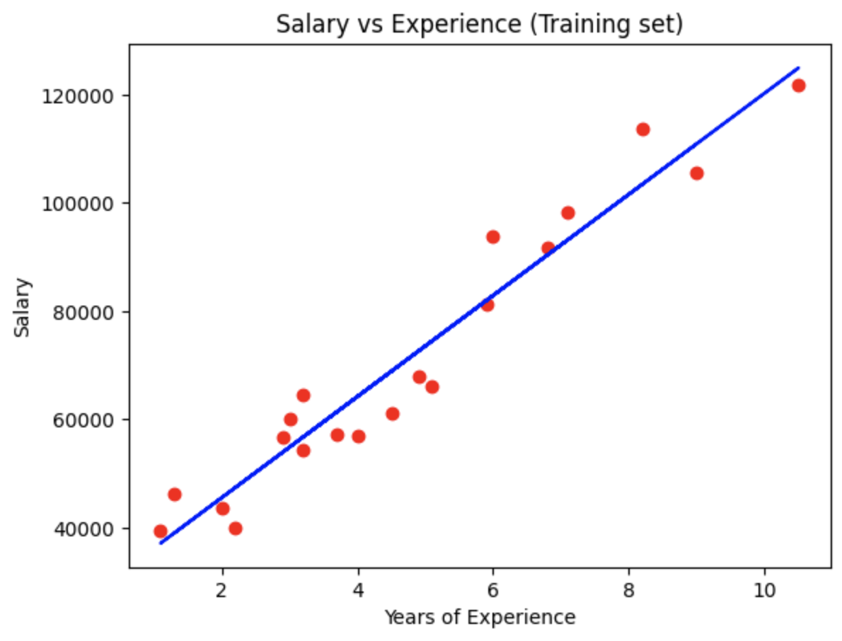
Step 6. Visualising the Training set results
- scatter : 산점도 그리는 함수
- plot : 회귀선 그리는 함수
- title : 제목
- xlabel : x축 라벨
- ylabel : y축 라벨
- show : 그래표 화면 표시
--------------------------------------------------------------------------------------------------------------------------------------------------------------------
(1) plt.scatter(독립 변수, 종속 변수, 옵션)
(2) plt.plot(독립 변수, 훈련 세트의 예측된 종속 변수, 옵션)
--------------------------------------------------------------------------------------------------------------------------------------------------------------------
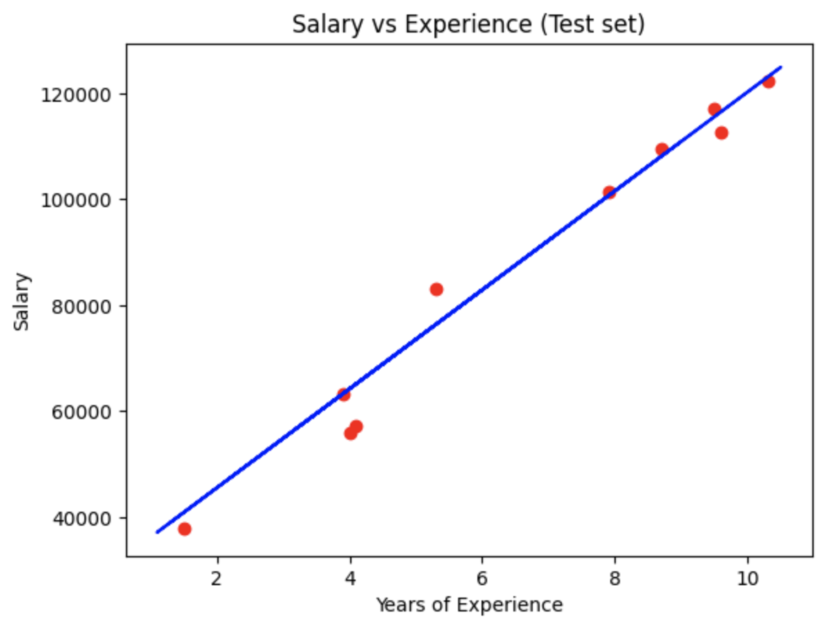
Step 7. Visualising the Test set results
※ 단순 선형 회귀 모델의 회귀선은 고유한 식에서 도출되어 고유함으로 테스트 세트의 회귀선을 별도로 생성할 필요없다.
'여러가지 > Python' 카테고리의 다른 글
| 섹션 8. 다항식 회귀 (Polynomial Linear Regression) (0) | 2024.07.18 |
|---|---|
| 섹션 7. 다중 선형 회귀 (Multiple Linear Regression) (0) | 2024.07.15 |
| 섹션 3. Python에서의 데이터 전처리 (Data Preprocessing) (0) | 2024.07.07 |
| Day26 - List Comprehension (0) | 2024.05.14 |
| Day25 - .csv 파일 및 pandas 라이브러리 (1) | 2024.05.02 |

